Atelier
Case Study · Fashion E-commerce · Design System

My Role
My Role
Design Lead
Design Lead
Client
Client
Atelier
Atelier
Type
Type
Brand identity · UX · UI · Design system
Brand identity · UX · UI · Design system
Timeline
Timeline
10 weeks
10 weeks
Strategy
Research
UX/UI design
Design systems
Atelier is a luxury fashion retailer offering curated collections from premium international brands through multiple digital touchpoints.
As the business expanded across five platforms, the customer experience became increasingly fragmented, with inconsistencies in navigation, shopping flows, and visual language. These differences made it difficult to deliver the cohesive, high-end experience customers expected while also slowing product scalability for internal teams. The challenge was not simply to redesign individual interfaces, but to unify the entire digital ecosystem under a shared product vision. Through user research, stakeholder collaboration, and strategic UX decisions, this project focused on creating a consistent commerce experience supported by a scalable design system. The result was a connected ecosystem that strengthened the customer journey while establishing a foundation for future growth.
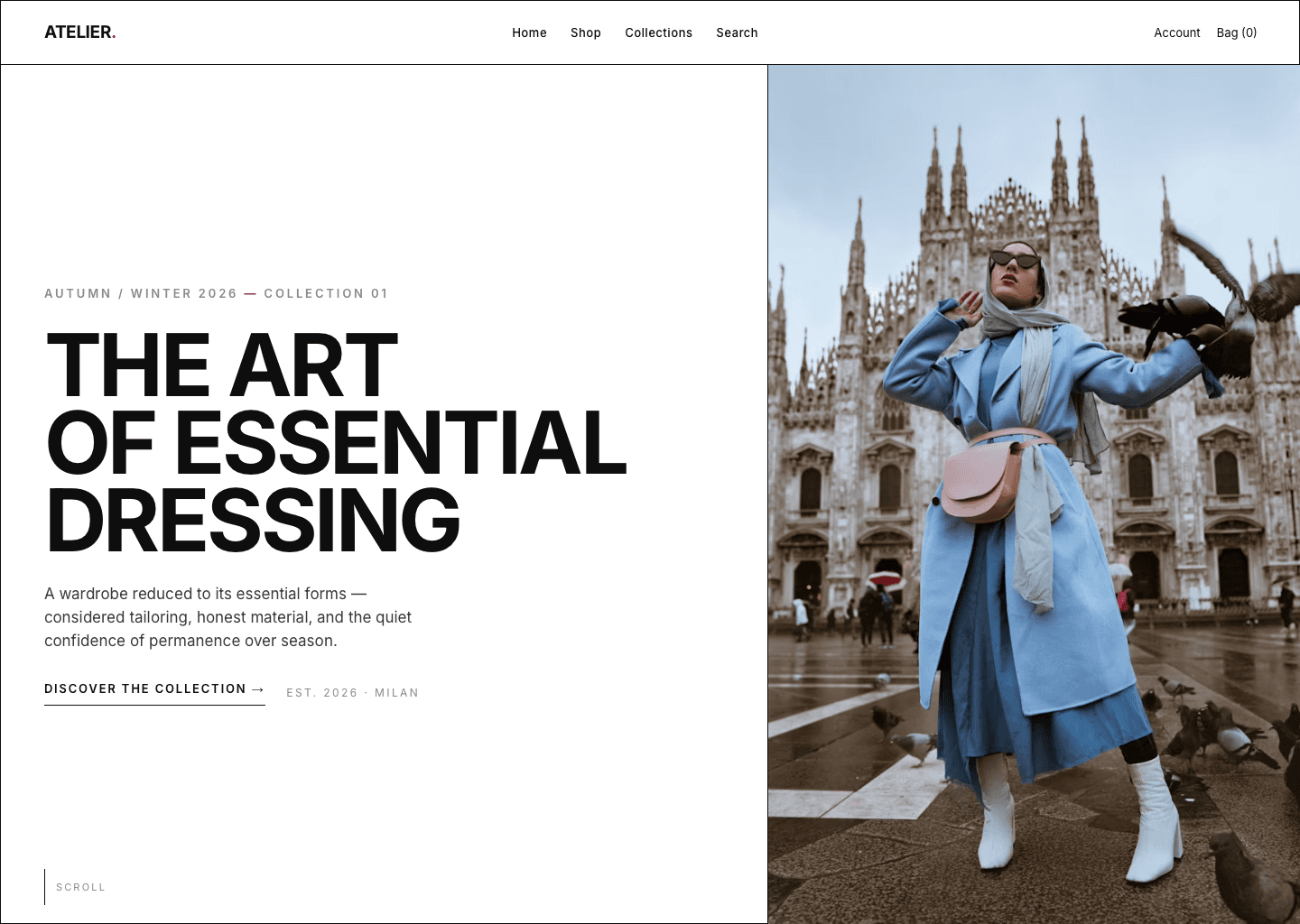
Saturated, and every store looks the same.
Shopping that feels like a luxury boutique.
Business problem
Premium brands compete in crowded spaces where visual identity is diluted by promotional content.
User problem
Cluttered interfaces and inconsistent layouts make browsing overwhelming and pull focus from the products.
Market observation
Retailers prioritise campaigns and content density over clarity. Effective short term, but it compromises premium perception.
The opportunity
Design a shopping experience where the product becomes the hero. Swiss Design principles (structured grids, refined typography, generous whitespace, clear hierarchy) reduce cognitive load and help users decide with confidence.
What the product needed to achieve, and how success would be measured.
Create effortless product discovery
Clear navigation, intuitive filtering, consistent hierarchy.
Build trust through simplicity
Reduce visual noise; let products become the primary focus.
Create a scalable design system
Reusable components that keep every touchpoint consistent.
Simplify the purchase journey
Fewer steps, predictable interactions from selection to checkout.
Understanding how premium shoppers evaluate products, build trust and decide.
User interviews
5 premium fashion shoppers · Ages 28–45 · Bought premium clothing online in the last 6 months
Competitive review
Fast fashion · Luxury retail · Premium DTC
Design references
Swiss grid systems · International Typographic Style · Editorial photography
Usability testing
Task-based · Browse → checkout · Cross-device consistency
What surprised me
I expected price to be the strongest trust signal. Instead, every participant judged the brand through its product photography before looking at price, specifications or reviews.
Four recurring patterns, directional rather than statistically representative, each informing a design decision.
Quality is judged through product photography before price or details.
Lead with large, authentic product imagery; minimise interface distractions.
Visual clutter reduced trust and increased abandonment.
Reduce promotional noise, simplify layouts, prioritise products over UI.
Brand consistency broke down across digital touchpoints.
One design system with shared components across every platform.
Shoppers preferred curated choices over overwhelming selection.
Curate the catalogue to reduce cognitive load and support confident decisions.
The pattern behind the patterns
The storefronts perceived as most premium embraced clarity over complexity. Premium wasn’t created by adding more. It emerged through restraint, hierarchy and deliberate design.
Three segments shaped the experience; one shopper from the primary segment guided most decisions.
Intentional buyers
Build a long-lasting wardrobe and carefully evaluate quality before purchasing.
Busy professionals
Shop on mobile between meetings; value speed, clarity and convenience.
Gift buyers
Purchase for others and rely on guidance, sizing and easy returns.

Lina Haddad
Buys few things, chosen well. Balances a demanding career with a busy personal life, preferring timeless pieces over trend-driven purchases.
“I want shopping to be calm, considered and reliable, so I can focus on the things that matter.”
Find quality pieces and brands she can trust · A calm shopping experience · Confident decisions · Fast, effortless checkout
Too many checkout steps · Confusing labels · No real reviews · Slow on mobile · Unclear delivery and returns
Where the category is crowded, and the gap worth taking. The high-editorial, high-luxury quadrant was effectively empty.

The gap
Two rows nobody owned: grayscale-led imagery and true cross-surface consistency. Calm by design, consistent across every surface.
A short, flat structure, nothing deeper than two levels, and the early layouts drawn on the grid.


Must
Editorial landing · 12-col shop grid · Grayscale plates · One-red add-to-bag · 3-step checkout
Should
Lookbook · Size guide · Fabric notes · Order tracking · Admin dashboard
Could
Saved fits & wishlist · Back-in-stock · Gift notes
Won’t
Promo banners · Badges · Carousels · Pop-ups · Colour photography in UI
Each screen framed as a decision, not a feature: the problem it answered, what I chose, and the evidence behind it.
Landing, the editorial split

The edit, a grid that frames

Product, plate + buy rail

Checkout, short and distraction-free

Admin, back of house, same house

One accent colour, used sparingly
One component kit: type, colour, spacing and states shared across every surface.
Radius 0 on web and admin · one red per screen · hairlines divide, never boxes with shadow.
components in one kit, from buttons and swatches to tables and charts
Grid system
Web & admin: 12 columns, 24px gutters, 64px page margin, 1280px max width. Tablet: 6 columns. App: 4 columns. The same rhythm, collapsed: 12 → 6 → 4 → 2 by surface. Spacing in multiples of 4.
Icons
1.5px stroke · square terminals · 24px grid: bag, search, account, arrow. No filled icons, no decorative sets.
Accessibility
Ink on Paper 17.71:1 (AAA) · Muted on Paper 3.16:1 (AA Lg) · White on Red 5.85:1 (AA) · Red on Paper 5.37:1 (AA). No state depends on colour alone.
The one-red rule
If two things are red on a screen, one of them is wrong. The accent is reserved for the single most important action in view.
The finished screens across all five surfaces.
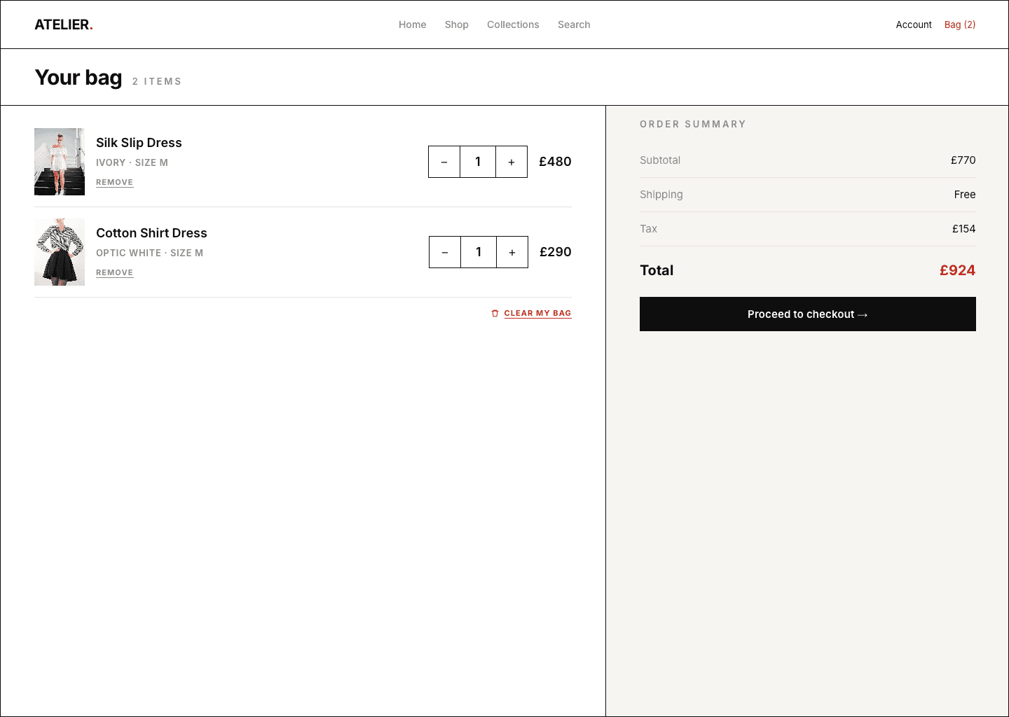

Landing to completed order, and the small interactions that give feedback without getting in the way.
Land
One calm editorial frame. No carousel, no pop-up.
The edit
A grid that frames each garment; filters, not promotions.
Product
Plates, fabric notes and honest sizing build trust.
Bag
Totals and returns up front, no surprises.
Checkout
Three quiet steps; the single accent marks the final action.
Plate crossfade
Hover swaps the garment plate to the back view, a slow, even fade.
Bag slide-in
The bag enters as a quiet right-hand rail; the page dims, nothing bounces.
Checkout stepper
Steps advance with a single hairline sweep.
How the design was validated with real users, before development.
Method
Five in-depth interviews and five moderated remote validation sessions. The prototype was evaluated with users to verify the core shopping experience before development.
What the project achieved, what I learned, and where the system goes next.
As a new product, these come from five moderated usability tests plus a component-system and accessibility audit. Directional given the sample size, but enough to show the design holds up. The step reduction came from removing optional account creation and promo-code steps, not from compressing forms.
What worked
Writing the rules down, a single accent colour and a fixed grid, did more than good intentions. Decisions got faster because we stopped re-arguing them on every screen.
What I’d improve
I spent too long on the landing page early on. Next time I’d test the checkout and account flows sooner, before polishing the parts that photograph well.
Where it goes next
Seasonal lookbook: same grid, new plates · Saved fits & wishlist without gamification · French and Arabic storefronts, the flush-left system tested against RTL.
Atelier
Case Study · Fashion E-commerce · Design System
My Role
My Role
Design Lead
Design Lead
Client
Client
Atelier
Atelier
Type
Type
Brand identity · UX · UI · Design system
Brand identity · UX · UI · Design system
Timeline
Timeline
10 weeks
10 weeks
Strategy
Research
UX/UI design
Design systems
Atelier is a luxury fashion retailer offering curated collections from premium international brands through multiple digital touchpoints.
As the business expanded across five platforms, the customer experience became increasingly fragmented, with inconsistencies in navigation, shopping flows, and visual language. These differences made it difficult to deliver the cohesive, high-end experience customers expected while also slowing product scalability for internal teams. The challenge was not simply to redesign individual interfaces, but to unify the entire digital ecosystem under a shared product vision. Through user research, stakeholder collaboration, and strategic UX decisions, this project focused on creating a consistent commerce experience supported by a scalable design system. The result was a connected ecosystem that strengthened the customer journey while establishing a foundation for future growth.
Saturated, and every store looks the same.
Shopping that feels like a luxury boutique.
Business problem
Premium brands compete in crowded spaces where visual identity is diluted by promotional content.
User problem
Cluttered interfaces and inconsistent layouts make browsing overwhelming and pull focus from the products.
Market observation
Retailers prioritise campaigns and content density over clarity. Effective short term, but it compromises premium perception.
The opportunity
Design a shopping experience where the product becomes the hero. Swiss Design principles (structured grids, refined typography, generous whitespace, clear hierarchy) reduce cognitive load and help users decide with confidence.
What the product needed to achieve, and how success would be measured.
Create effortless product discovery
Clear navigation, intuitive filtering, consistent hierarchy.
Build trust through simplicity
Reduce visual noise; let products become the primary focus.
Create a scalable design system
Reusable components that keep every touchpoint consistent.
Simplify the purchase journey
Fewer steps, predictable interactions from selection to checkout.
Understanding how premium shoppers evaluate products, build trust and decide.
User interviews
5 premium fashion shoppers · Ages 28–45 · Bought premium clothing online in the last 6 months
Competitive review
Fast fashion · Luxury retail · Premium DTC
Design references
Swiss grid systems · International Typographic Style · Editorial photography
Usability testing
Task-based · Browse → checkout · Cross-device consistency
What surprised me
I expected price to be the strongest trust signal. Instead, every participant judged the brand through its product photography before looking at price, specifications or reviews.
Four recurring patterns, directional rather than statistically representative, each informing a design decision.
Quality is judged through product photography before price or details.
Lead with large, authentic product imagery; minimise interface distractions.
Visual clutter reduced trust and increased abandonment.
Reduce promotional noise, simplify layouts, prioritise products over UI.
Brand consistency broke down across digital touchpoints.
One design system with shared components across every platform.
Shoppers preferred curated choices over overwhelming selection.
Curate the catalogue to reduce cognitive load and support confident decisions.
The pattern behind the patterns
The storefronts perceived as most premium embraced clarity over complexity. Premium wasn’t created by adding more. It emerged through restraint, hierarchy and deliberate design.
Three segments shaped the experience; one shopper from the primary segment guided most decisions.
Intentional buyers
Build a long-lasting wardrobe and carefully evaluate quality before purchasing.
Busy professionals
Shop on mobile between meetings; value speed, clarity and convenience.
Gift buyers
Purchase for others and rely on guidance, sizing and easy returns.
Lina Haddad
Buys few things, chosen well. Balances a demanding career with a busy personal life, preferring timeless pieces over trend-driven purchases.
“I want shopping to be calm, considered and reliable, so I can focus on the things that matter.”
Find quality pieces and brands she can trust · A calm shopping experience · Confident decisions · Fast, effortless checkout
Too many checkout steps · Confusing labels · No real reviews · Slow on mobile · Unclear delivery and returns
Where the category is crowded, and the gap worth taking. The high-editorial, high-luxury quadrant was effectively empty.
The gap
Two rows nobody owned: grayscale-led imagery and true cross-surface consistency. Calm by design, consistent across every surface.
A short, flat structure, nothing deeper than two levels, and the early layouts drawn on the grid.
Must
Editorial landing · 12-col shop grid · Grayscale plates · One-red add-to-bag · 3-step checkout
Should
Lookbook · Size guide · Fabric notes · Order tracking · Admin dashboard
Could
Saved fits & wishlist · Back-in-stock · Gift notes
Won’t
Promo banners · Badges · Carousels · Pop-ups · Colour photography in UI
Each screen framed as a decision, not a feature: the problem it answered, what I chose, and the evidence behind it.
Landing, the editorial split
The edit, a grid that frames
Product, plate + buy rail
Checkout, short and distraction-free
Admin, back of house, same house
One accent colour, used sparingly
One component kit: type, colour, spacing and states shared across every surface.
Radius 0 on web and admin · one red per screen · hairlines divide, never boxes with shadow.
components in one kit, from buttons and swatches to tables and charts
Grid system
Web & admin: 12 columns, 24px gutters, 64px page margin, 1280px max width. Tablet: 6 columns. App: 4 columns. The same rhythm, collapsed: 12 → 6 → 4 → 2 by surface. Spacing in multiples of 4.
Icons
1.5px stroke · square terminals · 24px grid: bag, search, account, arrow. No filled icons, no decorative sets.
Accessibility
Ink on Paper 17.71:1 (AAA) · Muted on Paper 3.16:1 (AA Lg) · White on Red 5.85:1 (AA) · Red on Paper 5.37:1 (AA). No state depends on colour alone.
The one-red rule
If two things are red on a screen, one of them is wrong. The accent is reserved for the single most important action in view.
The finished screens across all five surfaces.
Landing to completed order, and the small interactions that give feedback without getting in the way.
Land
One calm editorial frame. No carousel, no pop-up.
The edit
A grid that frames each garment; filters, not promotions.
Product
Plates, fabric notes and honest sizing build trust.
Bag
Totals and returns up front, no surprises.
Checkout
Three quiet steps; the single accent marks the final action.
Plate crossfade
Hover swaps the garment plate to the back view, a slow, even fade.
Bag slide-in
The bag enters as a quiet right-hand rail; the page dims, nothing bounces.
Checkout stepper
Steps advance with a single hairline sweep.
How the design was validated with real users, before development.
Method
Five in-depth interviews and five moderated remote validation sessions. The prototype was evaluated with users to verify the core shopping experience before development.
What the project achieved, what I learned, and where the system goes next.
As a new product, these come from five moderated usability tests plus a component-system and accessibility audit. Directional given the sample size, but enough to show the design holds up. The step reduction came from removing optional account creation and promo-code steps, not from compressing forms.
What worked
Writing the rules down, a single accent colour and a fixed grid, did more than good intentions. Decisions got faster because we stopped re-arguing them on every screen.
What I’d improve
I spent too long on the landing page early on. Next time I’d test the checkout and account flows sooner, before polishing the parts that photograph well.
Where it goes next
Seasonal lookbook: same grid, new plates · Saved fits & wishlist without gamification · French and Arabic storefronts, the flush-left system tested against RTL.
Atelier
Case Study · Fashion E-commerce · Design System
My Role
My Role
Design Lead
Design Lead
Client
Client
Atelier
Atelier
Type
Type
Brand identity · UX · UI · Design system
Brand identity · UX · UI · Design system
Timeline
Timeline
10 weeks
10 weeks
Strategy
Research
UX/UI design
Design systems
Atelier is a luxury fashion retailer offering curated collections from premium international brands through multiple digital touchpoints.
As the business expanded across five platforms, the customer experience became increasingly fragmented, with inconsistencies in navigation, shopping flows, and visual language. These differences made it difficult to deliver the cohesive, high-end experience customers expected while also slowing product scalability for internal teams. The challenge was not simply to redesign individual interfaces, but to unify the entire digital ecosystem under a shared product vision. Through user research, stakeholder collaboration, and strategic UX decisions, this project focused on creating a consistent commerce experience supported by a scalable design system. The result was a connected ecosystem that strengthened the customer journey while establishing a foundation for future growth.
Saturated, and every store looks the same.
Shopping that feels like a luxury boutique.
Business problem
Premium brands compete in crowded spaces where visual identity is diluted by promotional content.
User problem
Cluttered interfaces and inconsistent layouts make browsing overwhelming and pull focus from the products.
Market observation
Retailers prioritise campaigns and content density over clarity. Effective short term, but it compromises premium perception.
The opportunity
Design a shopping experience where the product becomes the hero. Swiss Design principles (structured grids, refined typography, generous whitespace, clear hierarchy) reduce cognitive load and help users decide with confidence.
What the product needed to achieve, and how success would be measured.
Create effortless product discovery
Clear navigation, intuitive filtering, consistent hierarchy.
Build trust through simplicity
Reduce visual noise; let products become the primary focus.
Create a scalable design system
Reusable components that keep every touchpoint consistent.
Simplify the purchase journey
Fewer steps, predictable interactions from selection to checkout.
Understanding how premium shoppers evaluate products, build trust and decide.
User interviews
5 premium fashion shoppers · Ages 28–45 · Bought premium clothing online in the last 6 months
Competitive review
Fast fashion · Luxury retail · Premium DTC
Design references
Swiss grid systems · International Typographic Style · Editorial photography
Usability testing
Task-based · Browse → checkout · Cross-device consistency
What surprised me
I expected price to be the strongest trust signal. Instead, every participant judged the brand through its product photography before looking at price, specifications or reviews.
Four recurring patterns, directional rather than statistically representative, each informing a design decision.
Quality is judged through product photography before price or details.
Lead with large, authentic product imagery; minimise interface distractions.
Visual clutter reduced trust and increased abandonment.
Reduce promotional noise, simplify layouts, prioritise products over UI.
Brand consistency broke down across digital touchpoints.
One design system with shared components across every platform.
Shoppers preferred curated choices over overwhelming selection.
Curate the catalogue to reduce cognitive load and support confident decisions.
The pattern behind the patterns
The storefronts perceived as most premium embraced clarity over complexity. Premium wasn’t created by adding more. It emerged through restraint, hierarchy and deliberate design.
Three segments shaped the experience; one shopper from the primary segment guided most decisions.
Intentional buyers
Build a long-lasting wardrobe and carefully evaluate quality before purchasing.
Busy professionals
Shop on mobile between meetings; value speed, clarity and convenience.
Gift buyers
Purchase for others and rely on guidance, sizing and easy returns.
Lina Haddad
Buys few things, chosen well. Balances a demanding career with a busy personal life, preferring timeless pieces over trend-driven purchases.
“I want shopping to be calm, considered and reliable, so I can focus on the things that matter.”
Find quality pieces and brands she can trust · A calm shopping experience · Confident decisions · Fast, effortless checkout
Too many checkout steps · Confusing labels · No real reviews · Slow on mobile · Unclear delivery and returns
Where the category is crowded, and the gap worth taking. The high-editorial, high-luxury quadrant was effectively empty.
The gap
Two rows nobody owned: grayscale-led imagery and true cross-surface consistency. Calm by design, consistent across every surface.
A short, flat structure, nothing deeper than two levels, and the early layouts drawn on the grid.
Must
Editorial landing · 12-col shop grid · Grayscale plates · One-red add-to-bag · 3-step checkout
Should
Lookbook · Size guide · Fabric notes · Order tracking · Admin dashboard
Could
Saved fits & wishlist · Back-in-stock · Gift notes
Won’t
Promo banners · Badges · Carousels · Pop-ups · Colour photography in UI
Each screen framed as a decision, not a feature: the problem it answered, what I chose, and the evidence behind it.
Landing, the editorial split
The edit, a grid that frames
Product, plate + buy rail
Checkout, short and distraction-free
Admin, back of house, same house
One accent colour, used sparingly
One component kit: type, colour, spacing and states shared across every surface.
Radius 0 on web and admin · one red per screen · hairlines divide, never boxes with shadow.
components in one kit, from buttons and swatches to tables and charts
Grid system
Web & admin: 12 columns, 24px gutters, 64px page margin, 1280px max width. Tablet: 6 columns. App: 4 columns. The same rhythm, collapsed: 12 → 6 → 4 → 2 by surface. Spacing in multiples of 4.
Icons
1.5px stroke · square terminals · 24px grid: bag, search, account, arrow. No filled icons, no decorative sets.
Accessibility
Ink on Paper 17.71:1 (AAA) · Muted on Paper 3.16:1 (AA Lg) · White on Red 5.85:1 (AA) · Red on Paper 5.37:1 (AA). No state depends on colour alone.
The one-red rule
If two things are red on a screen, one of them is wrong. The accent is reserved for the single most important action in view.
The finished screens across all five surfaces.
Landing to completed order, and the small interactions that give feedback without getting in the way.
Land
One calm editorial frame. No carousel, no pop-up.
The edit
A grid that frames each garment; filters, not promotions.
Product
Plates, fabric notes and honest sizing build trust.
Bag
Totals and returns up front, no surprises.
Checkout
Three quiet steps; the single accent marks the final action.
Plate crossfade
Hover swaps the garment plate to the back view, a slow, even fade.
Bag slide-in
The bag enters as a quiet right-hand rail; the page dims, nothing bounces.
Checkout stepper
Steps advance with a single hairline sweep.
How the design was validated with real users, before development.
Method
Five in-depth interviews and five moderated remote validation sessions. The prototype was evaluated with users to verify the core shopping experience before development.
What the project achieved, what I learned, and where the system goes next.
As a new product, these come from five moderated usability tests plus a component-system and accessibility audit. Directional given the sample size, but enough to show the design holds up. The step reduction came from removing optional account creation and promo-code steps, not from compressing forms.
What worked
Writing the rules down, a single accent colour and a fixed grid, did more than good intentions. Decisions got faster because we stopped re-arguing them on every screen.
What I’d improve
I spent too long on the landing page early on. Next time I’d test the checkout and account flows sooner, before polishing the parts that photograph well.
Where it goes next
Seasonal lookbook: same grid, new plates · Saved fits & wishlist without gamification · French and Arabic storefronts, the flush-left system tested against RTL.